Event Interactive Map
Using AI tools to turn changing event needs into a useful guide for visitors and organizers
Community Project
2026
Developer / Technical Artist
Context
An interactive guide for the SJTU Silicon Valley Alumni Association's Annual Alumni BBQ + Fair, a large community fair attended by nearly 400 people. Built and refined with AI tools, the map brings venue layouts, booth information, and activity instructions into one bilingual experience for visitors and organizers.
My Contribution
Translated event needs and organizer materials into a working web experience, using AI-assisted development and a Figma Make design pass. Directed successive updates to the venue layout, mobile interface, activity content, and staff workflow, checking each against the event's practical needs.
Impact / Outcome
Built a bilingual event guide for a large community fair attended by nearly 400 people, bringing the venue plan, activities, and participation instructions together. Visitors could find what to do and how to join, while organizers could keep information current as plans evolved.
Outcome Summary
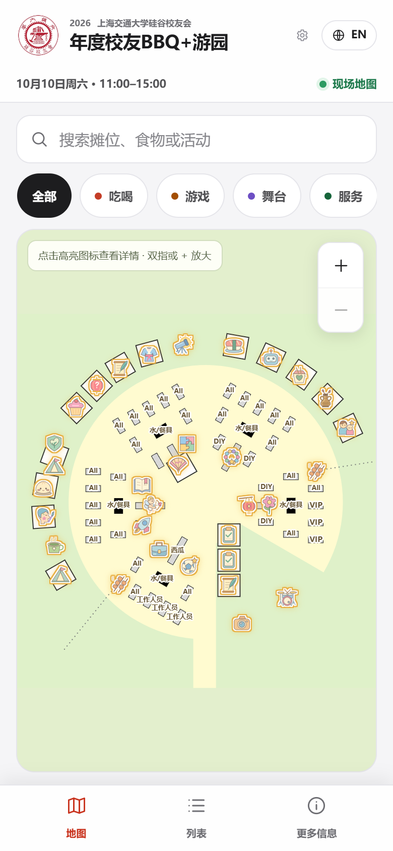
Start with the Event
The SJTU Silicon Valley Alumni Association's Annual Alumni BBQ + Fair brought nearly 400 participants together for a large community fair at Baylands Park on October 10, 2026. I built Event Interactive Map to bring the venue layout, activity information, and participation instructions into one bilingual guide for visitors and organizers.
With food, games, alumni activities, and shared facilities spread across the venue, the useful questions were simple: What is here? Where do I go? How do I take part?
The answers were spread across venue drawings, event announcements, and individual activity descriptions. The map's purpose was to bring them together in a form people could use on their phones, while giving organizers room to keep updating the information.
I used AI tools throughout development, from building the first working version to refining individual interactions. My role was to define the requirements, supply the event context, review the results, and keep each change tied to what participants and organizers actually needed.
1. Turn the Requirements into a Working Prototype
The initial requirements were a map people could explore, a way to find booths quickly, details that explained each activity, and Chinese and English support. A list view provided another way to browse when searching a visual map was less convenient.
AI-assisted development made it possible to put those requirements into a working browser experience early. That gave me something concrete to inspect: whether the navigation made sense, whether the map was readable, and whether opening a booth answered a visitor's next question.
2. Refine the Interface with Figma Make
After the functional foundation, I used a Figma Make design pass to refine the interface and brought that design into the application. The focus was the visitor's path through the information: search and categories, map or list, then activity details.
I continued using AI coding tools for focused revisions to spacing, icons, labels, and mobile behavior. Reviewing the actual screens helped turn broad requests such as "make the map clearer" into specific changes that could be checked on a phone.
3. Keep Up with the Changing Venue Plan
The organizer's venue layout changed several times. Each new drawing became an input for another AI-assisted update: compare the plans, identify moved or added locations, update the map, and check it against the reference.
Full map on a phone
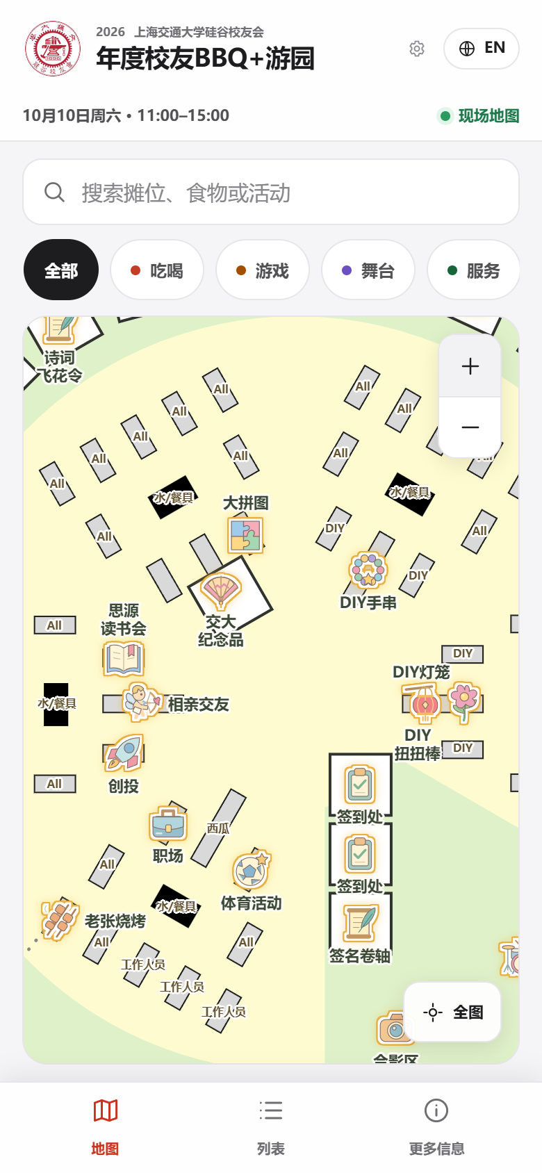 Zoom in to reveal activity names
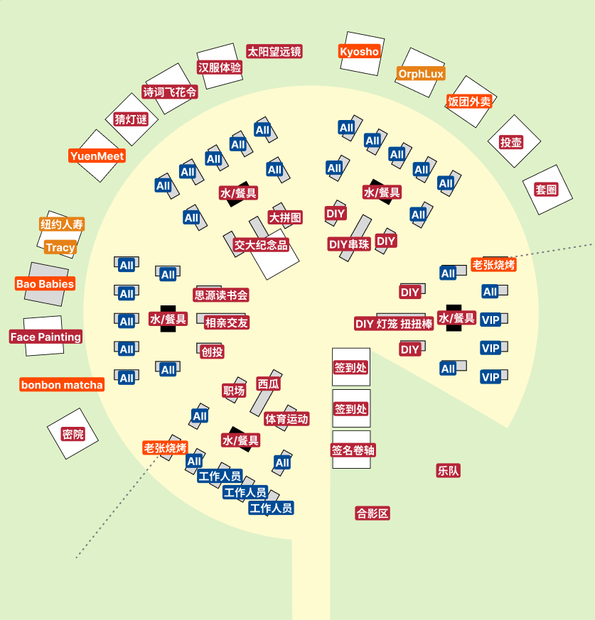 Original venue design
This needed judgment beyond copying labels. Two activities could share one tent, while a table marked "DIY" might simply be shared workspace. Entrance tents, seating, staff areas, and queue directions all had different purposes. I used those distinctions to guide the updates and checked ambiguous cases against the surrounding layout and existing activity information.
Moving a booth also needed to preserve its existing description and photos. Keeping that continuity let the map follow the evolving plan without repeatedly rebuilding the content.
4. Make the Map Easier to Read and Use
Once the locations were in place, the next iterations focused on what visitors should notice and tap. I used AI-assisted changes to address specific points of confusion:
- Highlight activity icons so tappable locations are easy to recognize.
- Keep names horizontal and reveal more labels when zooming in, reducing clutter in the overview.
- Show seating, staff tables, and water stations without making them look like activity buttons.
- Keep separate activities distinguishable when they share a tent.
- Combine Family / Ring Toss into one entry to match the event's actual activity grouping.
These were small changes individually, but each helped the interface communicate the event more accurately.
5. Turn Activity Information into Participation Guidance
Finding a booth is only the first step. As official announcements, photos, and activity materials became available, I used AI to help organize them into the relevant booth pages. This expanded the map from a location guide into an explanation of what visitors could do.
Later updates added clearer participation instructions and stamp tasks. For Family / Ring Toss, for example, visitors can read the qualifying task, how the ring-toss activity works, and the associated rewards. Chinese and English versions make that information accessible through the same interface.
Visitors can tap a booth for a short introduction while keeping the map in view, then pull the detail sheet up to explore its photos, stamp task, and participation rules. The Chinese mobile screens below show those two stages for Family / Ring Toss.
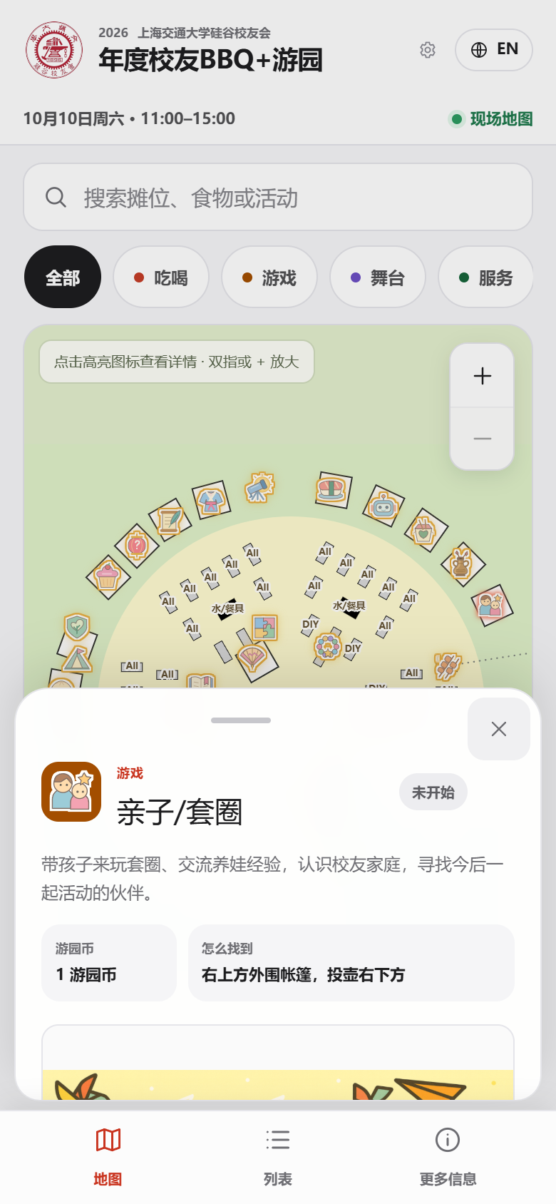 Tap a booth for a quick introduction
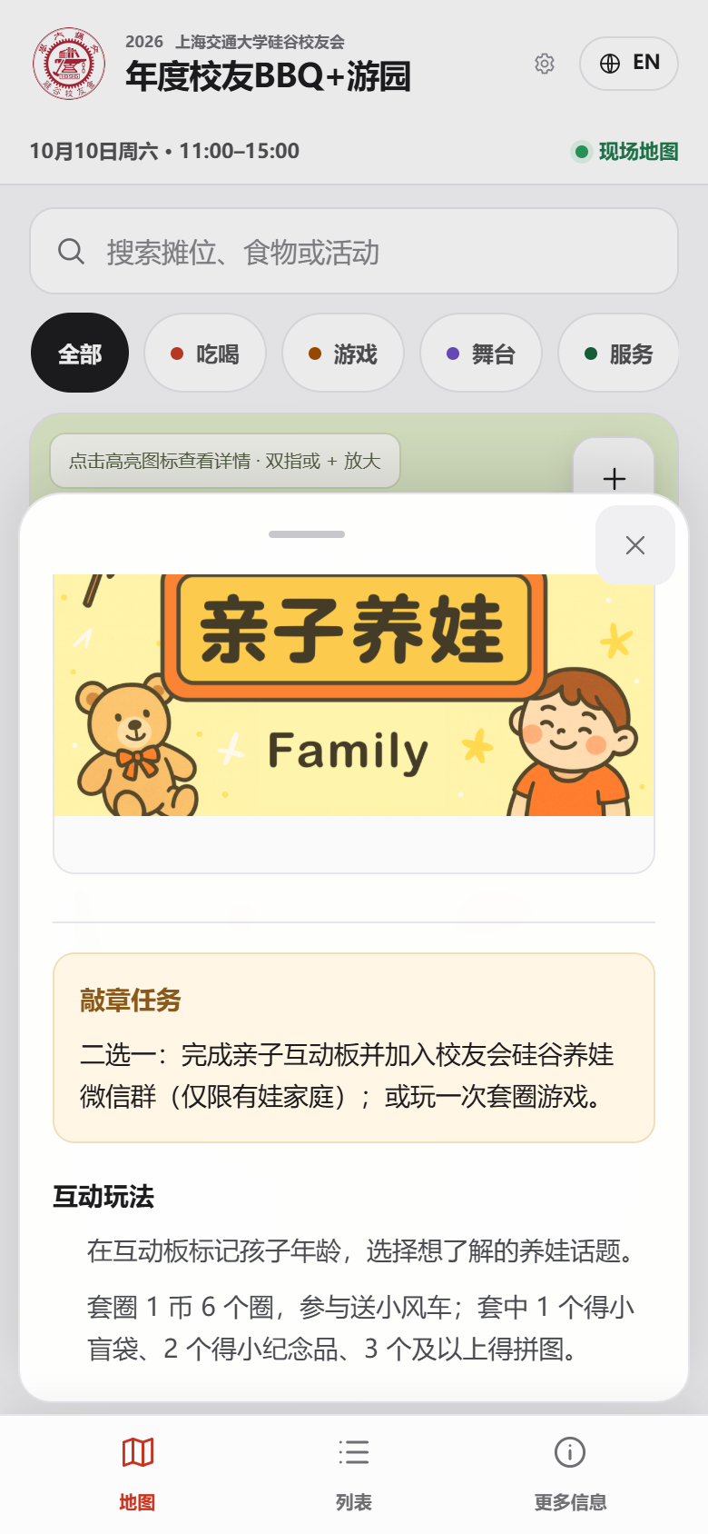 Pull up to explore stamp tasks and activity rules
Reviewing source material remained important. New announcements could contain outdated dates, duplicate information, or screenshots of the map itself. The updates needed to add useful activity content while preserving confirmed event details and edits already made by organizers.
6. Give Organizers a Way to Keep It Useful
The same process extended to the staff workflow. Organizers needed to edit descriptions and images, adjust locations, and communicate changes without turning every update into another development task. The application includes staff editing, publish controls, booth states, and announcements for those needs.
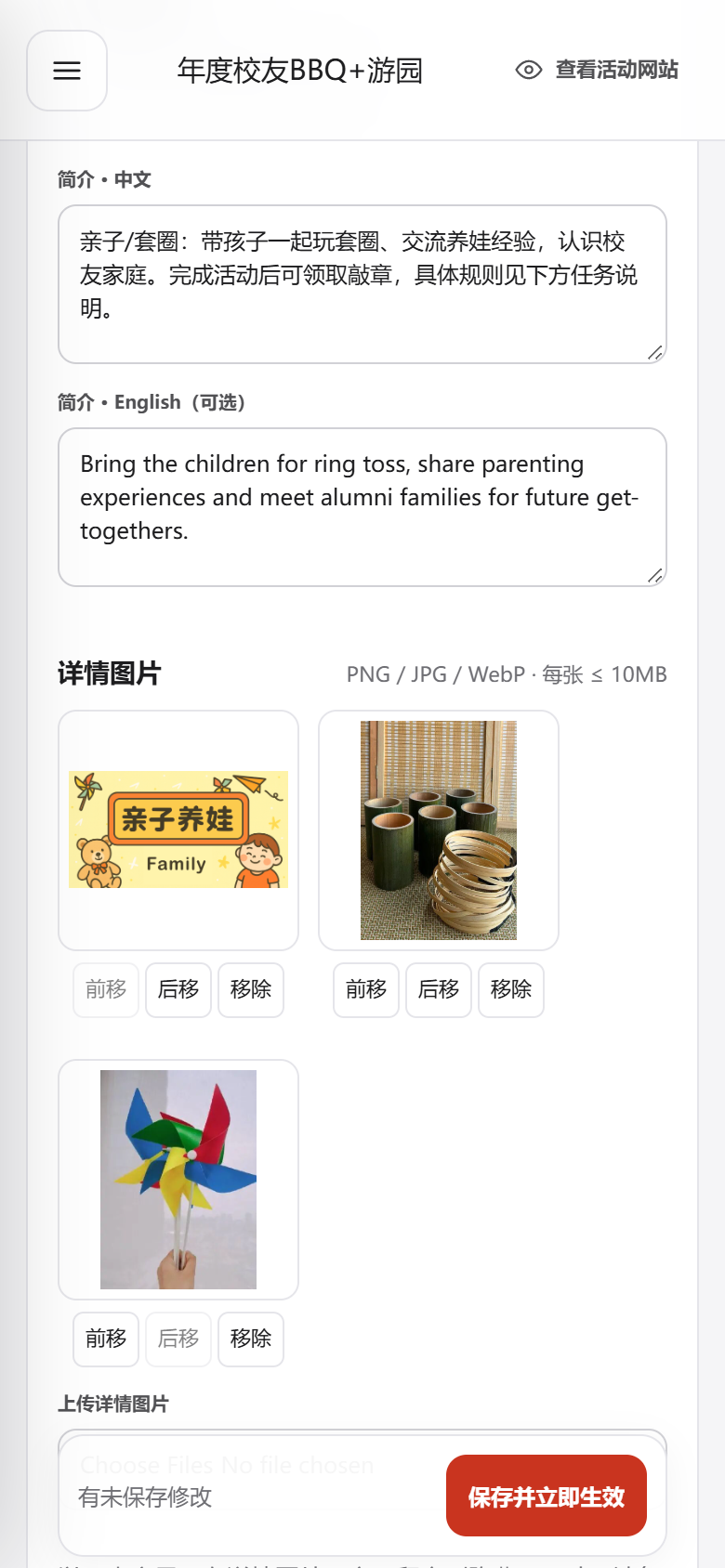 Admin workflow demo: editing booth descriptions and photos
Visitors can browse without signing in, and an open page refreshes its event information. If connectivity drops, it can retain recently loaded information and indicate that it may be out of date. These details support the practical setting in which the map is meant to be used.
What This Project Demonstrates
AI tools supported a repeated cycle: define a need, provide references, implement a focused change, inspect the result, and refine it against the event. Figma Make helped with the visual direction, while AI-assisted implementation supported the continuing layout, content, and interaction updates.
My contribution was connecting those tools to a real, changing set of requirements. The result brings the venue, activities, and participation instructions into one guide, with a way for organizers to maintain it. It reflects the same approach I bring to technical art and production tools: understand the people using the system, make their next action clearer, and keep improving the workflow as the needs become more specific.
Related Projects
 WIP
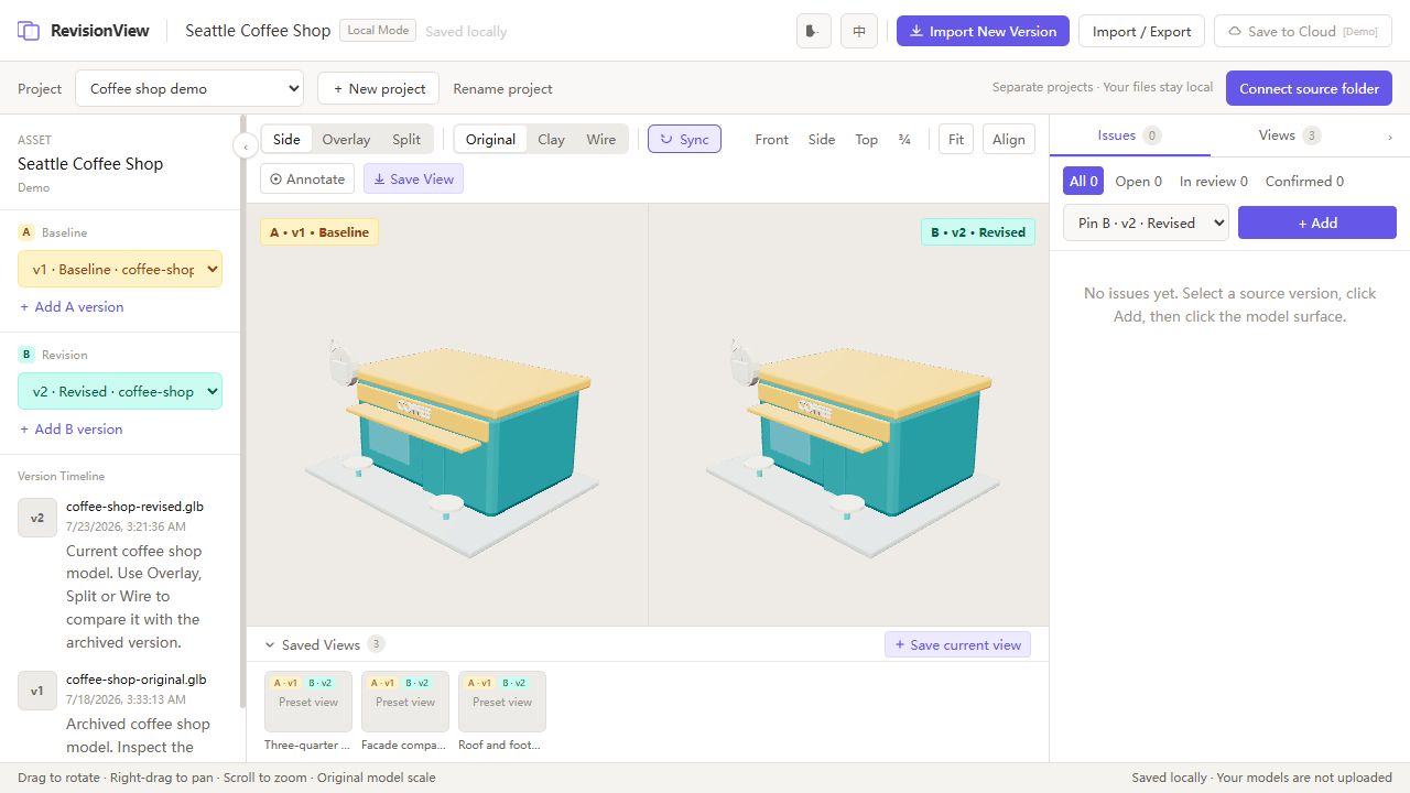
WIPRevisionView 3D
Personal Project · 2026
A browser-based model comparison tool built to support faster asset iteration
Impact
Turned a recurring Road Trip asset-review task into a reusable tool for checking visual changes across revisions. The comparison workflow is usable today; the standalone product remains a work in progress.
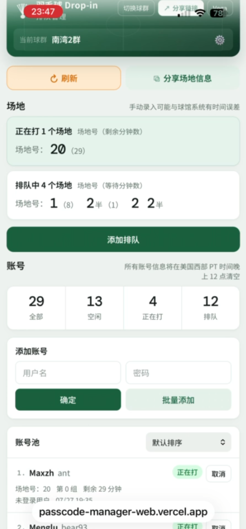
Badminton Drop-in Queue Manager
Personal / Community Tool · 2026
Lightweight web app for shared passcode registration, court queueing, and group visibility
Impact
Moved a busy badminton group's passcode and court coordination out of chat messages and into a shared web workflow. The app has been in active use for several weeks by a primary group of about 500 members, with registration behavior becoming more self-service and transparent.
Vega Bai Portfolio Website
Personal Project · 2026
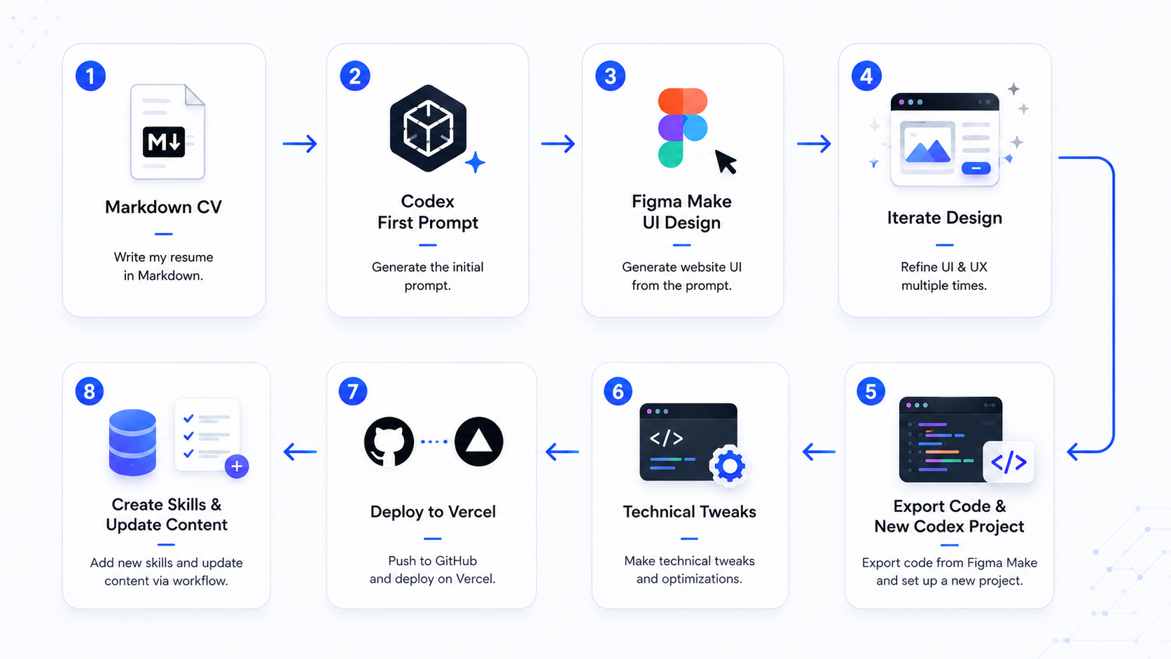
AI-assisted portfolio system for presenting technical art, pipeline tools, and production case studies
Impact
Turned a resume and scattered project history into a focused, maintainable portfolio system that presents technical art experience through production problems, pipelines, tools, and outcomes rather than only visual results.